Design
The Story of Our New Website
tl;dr This year, exping ranked 2nd in the Graphics & Design category on the App Store at one point. However, when some new users wanted to find out "What is exping?" but could only access our outdated official website built last year. We realized it was a great time to update the website.
Last month, we launched a brand new official website for exping. After a year of steady iterations, exping has added many new features and gained a lot of popularity among users, even ranking 2nd in the Graphics & Design category on the App Store at one point. However, when some new users wanted to find out "What is exping?" but could only access our outdated official website built last year, we realized it was a great time to update the website.

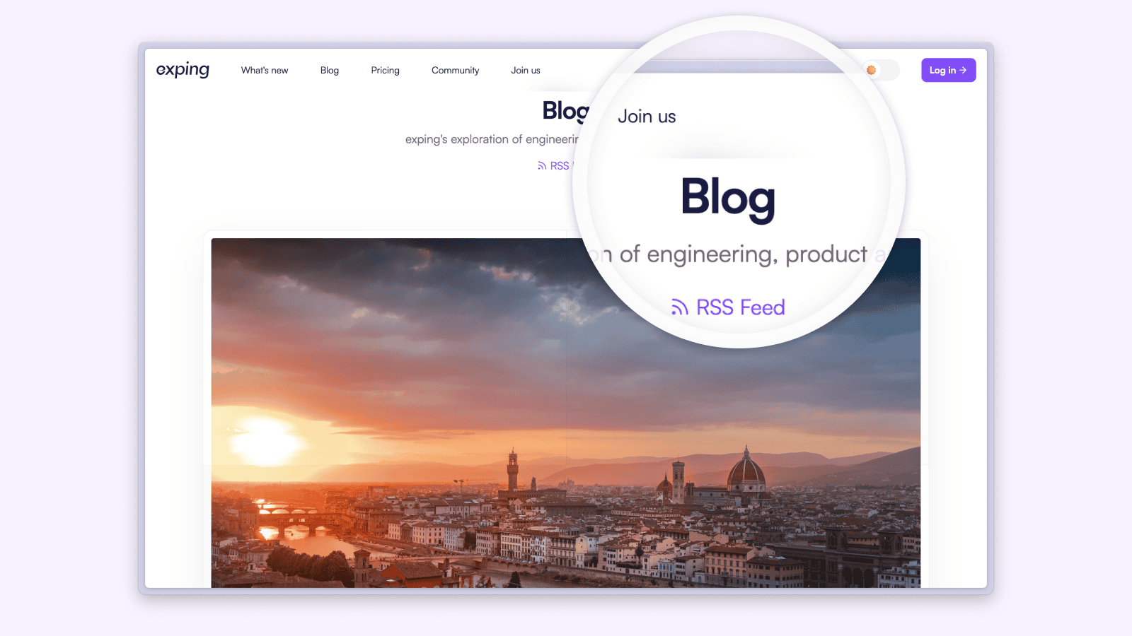
For this redesign, we thoroughly reviewed and optimized the information architecture so that you can find what you need more intuitively and quickly, greatly improving visit efficiency. We also incorporated the visual and brand adjustments we've made over the past year into the new website. Finally, in addition to a brand new look, the website also features new contents like blog, changelog, and help center.
Designing and developing this product, yes, refer to it as a "product”, has been a meaningful journey for me. There is a lot I could show you. But at this time I’d like to focus on interactions in the new landing page, which also demonstrate how we integrated exping's spirit into the product, design, and development.
Browsing, not over interactive
During the visual design, we were very excited to design so many interactive elements. However, as development progressed and we browsed more landing pages, I realized it was not an appropriate choice. Acquiring the information I need is the most important thing for me. If most of the content requires proactive interaction, much of the content will be hidden, leaving the overall impression of being ”incomplete”. That looks so terrible. Proactive triggered interactions are better suited as an after-dinner "dessert", not the "main course".
Although development had already started, I still decided to redesign the interactions. Of course, as we incorporated new design ideas while developing concurrently, our workspace became extremely messy. My partner once said that "It is just like Einstein's desk".
It was troublesome later on when a designer drove development. But for now, let's get back to our interactions.
Scroll-driven animations
At first, I changed many interactions requiring proactive triggers to scroll-driven. There are some nice frameworks we can choose from, such as GSAP ScrollTrigger, Framer Motion and native CSS.
Chrome released some new web animation features half a year ago, one of which is scroll-driven animations. An engineer in Google created a website called Scroll-driven Animations to explain this new feature and provided a plugin called Scroll-Driven Animations Debugger to assist developers.
I ultimately chose to use GSAP, which I had previously used in another project.
GSAP is a robust JavaScript toolset that turns developers into animation superheroes. Build high-performance animations that work in every major browser. Animate CSS, SVG, canvas, React, Vue, WebGL, colors, strings, motion paths, generic objects...anything JavaScript can touch. Recently, the GSAP official website updated as well. I highly recommend everyone to check it out.
Indeed, one of the more significant reasons is that the Timeline in GSAP is well-suited for designers. The syntax in GSAP is slightly different from web development, which may initially give the impression of having to learn a new language. But once you become proficient with Timeline, it feels familiar, similar to designing with a timeline in After Effects. A phrase came to my mind: Design with code.
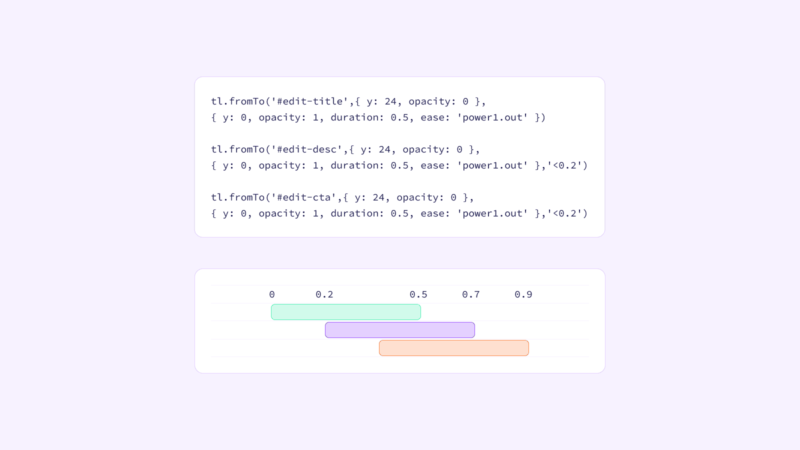
Natural Motion🌟
In addition to change interactions to scroll-driven animations, each section also features basic natural animations for titles, descriptions and action buttons. This effect took more time than anticipated, and it is one of my favorite effects in the website. It allowed me to learn the level of detail that lies between "how it looks like" and "how it actually is.”
OK, let’s start.
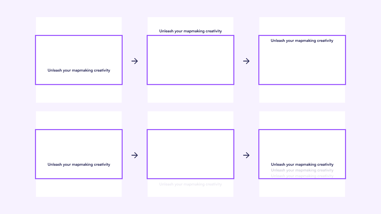
Appearing naturally
When it comes to talking about nature, the first thing is to see it naturally. My aim is to achieve the effect of "when you should see it, it naturally appears before your eyes." This may sound simple, but the implementation is another matter altogether.
The first thing we need to define is what "when you should see it" means. As I kept browsing different pages, I realized that it can essentially be equated to when I have finished viewing the current section and am ready to move on to the next section.
In other words, it's when the next section appears from the bottom of the page and scrolls into my line of sight. Once we understand this, the remaining step is to achieve a natural feeling by debugging different position values.
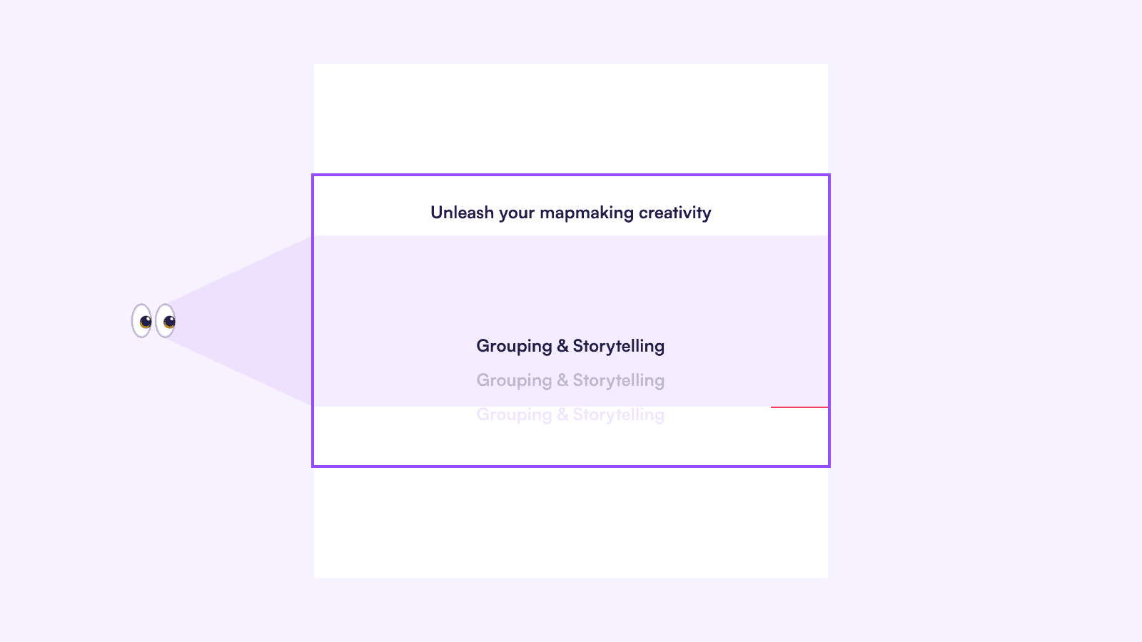
The next thing that needs to be addressed is "it" referring to the entire section or just the title. There is a little difference in padding between the two, and although small, it is still a factor I need to consider. This is a question without a definitive answer. I decided to use the itself as the trigger.

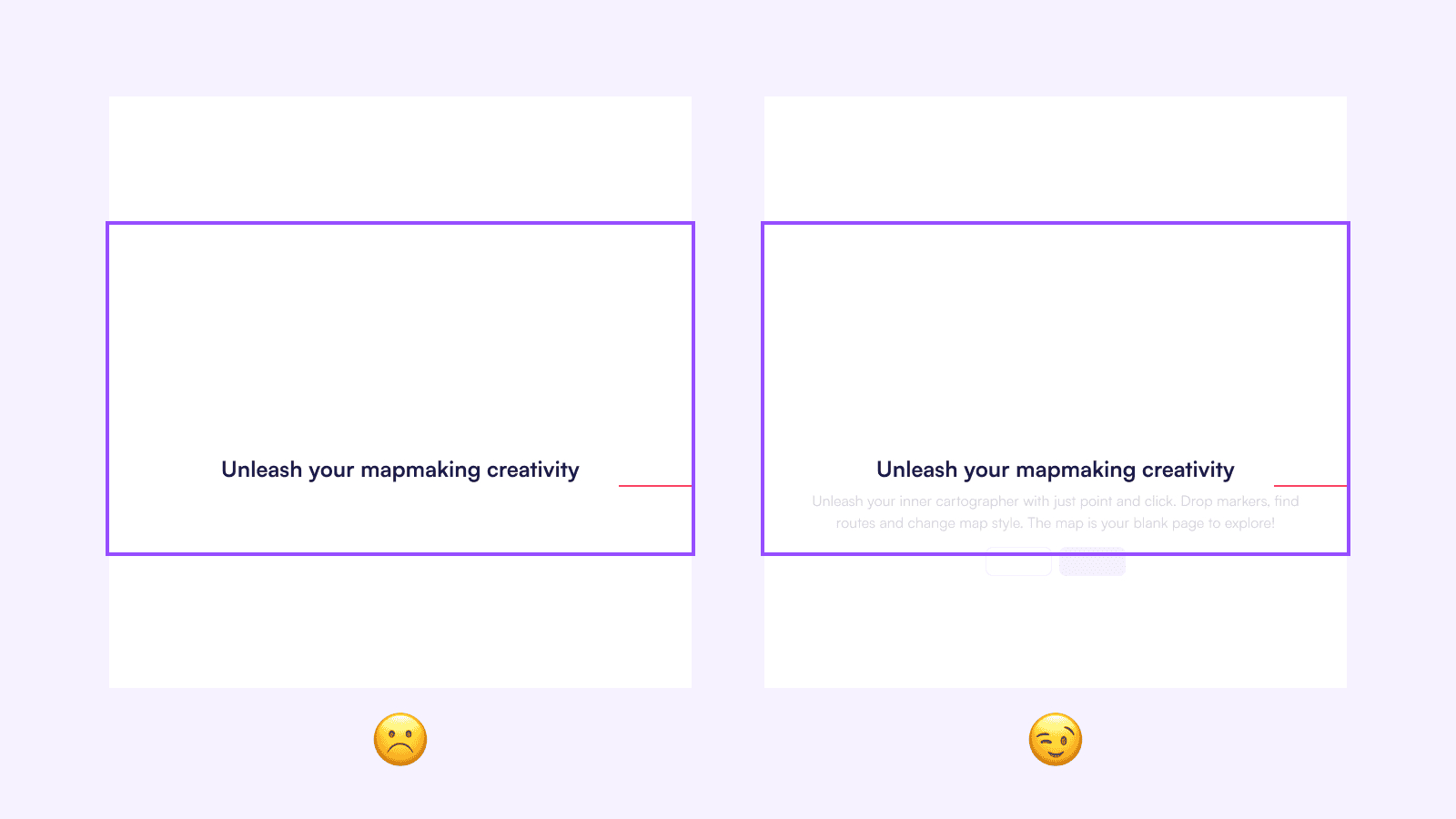
One and more
In the previous section, we have designed the entrance animation for individual elements. However, Should the animations for other elements in the same section also follow the rule of appearing when the user should see them, using themselves as triggers?
Indeed, you're right. It would not be appropriate here. If a user were to stop scrolling after the title has appeared, it could result in a blank space below the title since the other elements haven't reached their defined "natural points" yet.
My approach is to consider these elements as a unit triggered by the same title, in order to activate a GSAP Timeline animation for handling the appearance of multiple elements.
The elements mentioned above all share a common characteristic - they are vertically aligned. But what about horizontally aligned elements? Do they also need to have animations that appear sequentially? In this case, my answer is no. The animation order for horizontally aligned elements will be as shown below:

Once or more
Let's continue refining this animation. Does the animation only need to play once? When this section exits the viewport from the top and bottom, and re-enters the viewport, should the animation play again? This is also a question without a definitive answer. Here's my approach:
-
When it exits the viewport from the top and re-enters: Do not replay the animation.
-
When it exits the viewport from the bottom and re-enters: Play the animation in reverse and replay it upon re-entry.
GSAP indeed provides several simple configurations to handle this scenario, making it easy to implement. This is one of the reasons why I chose to use GSAP as well.
Designers hate “linear“
Certainly, that was a joke. But there is one last thing related to this point. To achieve smoother transition effects, designers often prefer to use Ease curves instead of Linear curves when designing animations.
However, we face a challenge in this scenario. Since we can assume that users scroll the page at a constant speed, it is necessary for all scroll-driven animations to use the corresponding Linear curves to synchronize with the user's scrolling speed. Otherwise, subtle inconsistencies may arise, resulting in a sense of imbalance.
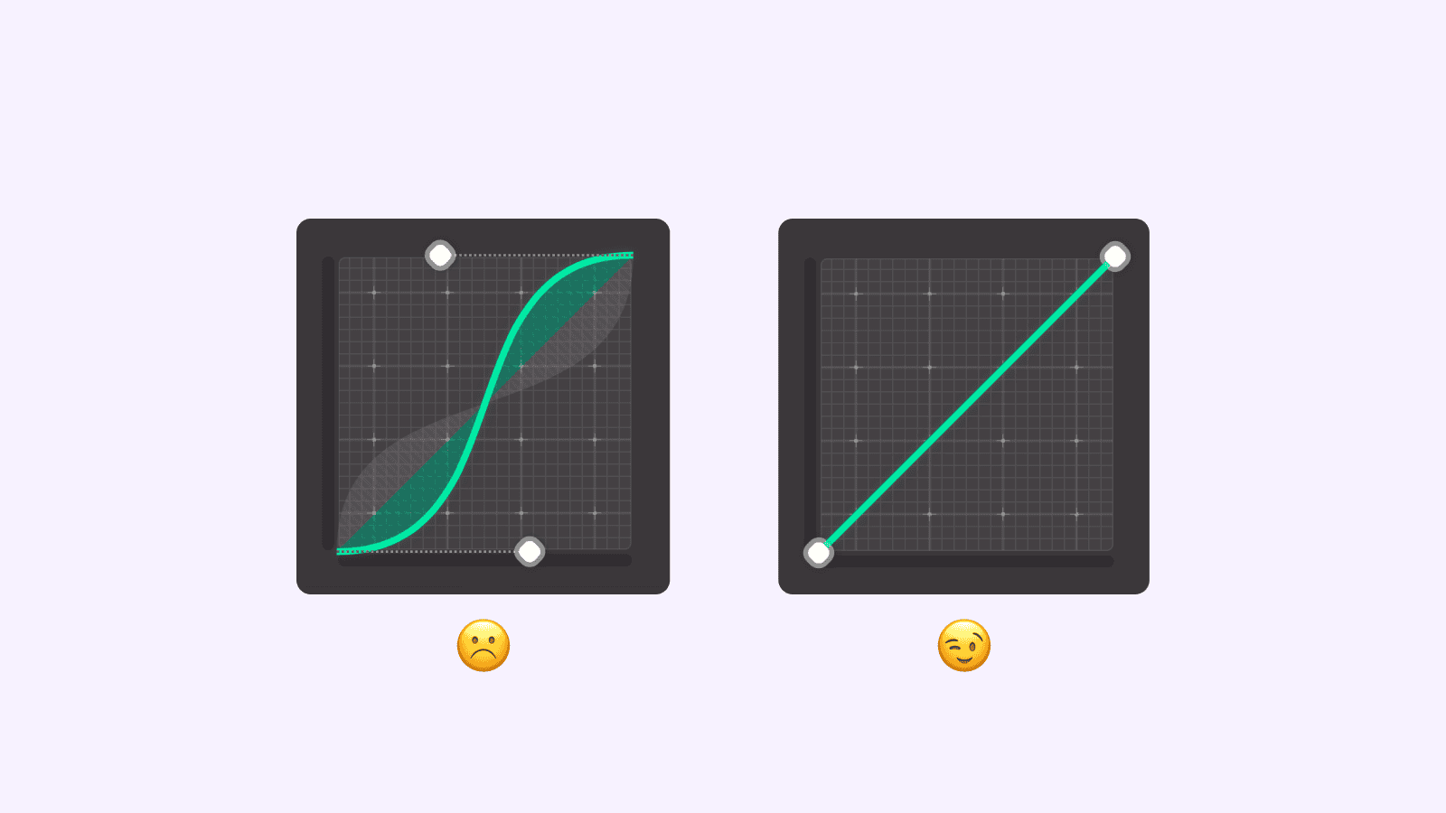
For example, when scrolls 50px, an element scales from 100% to 110%. However, when they continue scrolling another 50px, the element suddenly scales from 110% to 150%. It might lead you to wonder if they missed something or if there is a discrepancy in the animation.
This is why I have to use the Linear curve, which all designers hate.
Is that really all?
Just when you thought you had resolved the issues with the basic animations, more intricate details await your attention. Do not forget that we are creating a website that should be accessible from virtually anywhere, accommodating diverse viewport sizes. For example, how should we handle a situation where the height exceeds the width, causing content that should originally appear on the second or third screen to be immediately visible from the start?
There is another aspect to consider. When the height becomes substantial, do the previously established "natural points" still retain their natural positioning in this proportion?

These two questions, along with other questions raised earlier, are all without definitive answers. I spent a considerable amount of space discussing them at length in order to illustrate the multitude of details that need to be taken into our journey towards perfection when translating "visual language" into the language of code.
Playground
During the development, we recorded numerous ideas, and it could even be said that this is our playground where we can explore freely. So, I once jokingly said, "A serious engineer would never be able to develop this website.”
Highlight Section
In the highlight section, we placed a continuously changing ellipse in the background. Essentially, it is a rectangle.
We all know that the border-radius property can be used to individually set multiple different values. Furthermore, we can finely adjust the curvature of each individual edge within a single corner.
Learn more: CSS Border-Radius Can Do That?
After adding a few more keyframes, the basic animation is complete. But wait, now it looks like the four corners are moving independently.
The solution to this problem involves applying a rotation animation to the entire element. When the two animations are combined, it creates a flowing effect.
Collaboration Section
You can enable the collaboration feature and create together with other explorers on the same map in exping. In the introduction section of this feature, you can simultaneously view the browser and mobile interfaces, where I have designed a small interaction.
To introduce the collaboration feature, it is natural to demonstrate its ability to synchronize data. Here, we use another plugin of GSAP called Draggable, which allows for easy implementation of dragging and boundary constraints.
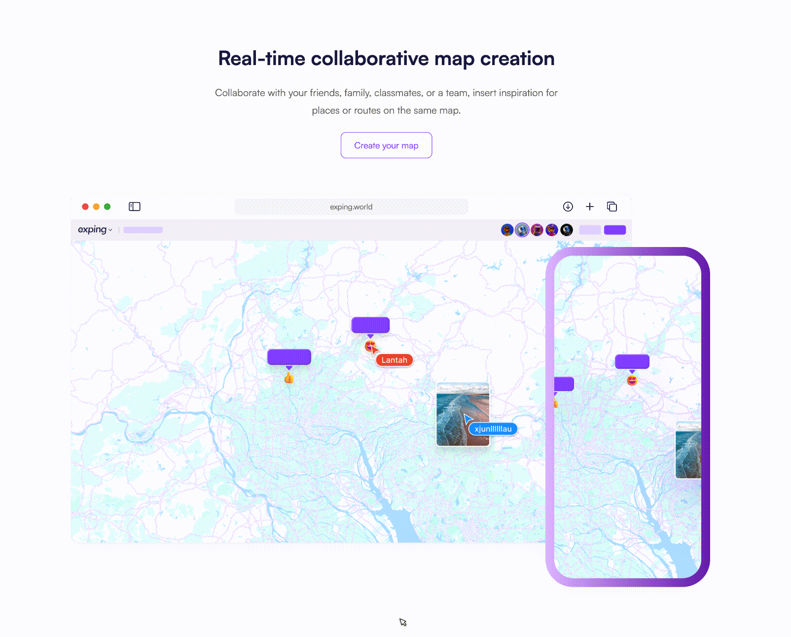
I initially fell into a misconception, thinking that I could use the original coordinates of the draggable element as the baseline value and perform numerical calculations to determine the transformed position. However, upon examining the code after dragging, I realized that the dragging effect is achieved by adding a transform: translate3d(x, y, z) to the original element. To achieve synchronization, I simply need to extract the values from the transform property and apply the same transformation to the other element.
Another important aspect to consider is the difference in size between the two maps and elements. This means that the applied transformation needs to incorporate a scaling factor. By multiplying the appropriate scaling factor, I can ensure that the transformation is consistent across elements of different sizes.

Scroll smoother
On mobile devices, the browser usually includes the default feature of inertial scrolling. We wanted to bring that same feature to desktop. We could easily achieve this using the GSAP ScrollSmoother plugin. However, it's unfortunate that this plugin requires a Club membership.
In this case, we switch to Lenis and we are very satisfied with the final result it provides as well.
The effect of inertial scrolling has only been added to the landing page, while other content pages do not have it. For anyone who wishes to compare, you can feel the difference by contrasting this page with the landing page.
Bien-glass
I came across a tweet that shows a more natural glass reflection effect. Normally, the background blur effect is only displayed when two elements overlap, but this modification allows for a reflection effect to appear as the two elements approach each other.
It's really cool!
I spent about half an hour adding it into our website. However, it's unfortunate that this effect can currently only be implemented on non-landing pages.
Our new website is filled with many more interactive and design details beyond what was mentioned above. As mentioned earlier, it's like our playground where we have a lot of fun exploring.
It’s time to launch🚀
Being a designer and overseeing the progress can sometimes present a challenge. Even though I hope to give equal attention to our direction, content, design and development, it's still easy to unintentionally focus too much on visual design.
This includes not only interactive animations but also making adjustments to certain design drafts during development. We often find ourselves constantly generating new ideas such as fine-tuning the inertia scrolling damping value or continuing to refine the copywriting.
I completely understand I need to choose the right moment to pause and launch a product. After making the decision, we pressed the launch button one evening and released the website you see now.
I would also like to express my gratitude to my another partner, AI, for helping me resolve some problems during the development, making it possible for me to complete this landing page.
After the launch, the new website has met our expectations. We have seen a significant increase in website traffic compared to before, which has fulfilled one of our goals. Moving forward, we will continue to refine our products including exping and this website. You can use RSS to subscribe to our blog and receive updates.
Lastly, what I want to express in the end is that we didn't just build this new website out of professional obligation. We also created it with great pleasure and enthusiasm. We sincerely hope that you will enjoy it and explore its details. If this article or website catches your interest and encourages you to give our product a try, that would be truly wonderful.
Share