Design
Designer Talks: Creating the Unique exping light Map Style
tl;dr Over the past three months, we've undergone significant changes and improvements. We've had more opportunities to engage with our users, leading to a clearer understanding of our product positioning and mission.

Following our previous article《The Birth of exping: How a Map Creation Tool Came to Be》 , we've received overwhelming support and valuable suggestions. We're grateful for the recommendation from Sspai, which has brought exping to a wider audience, including investors and media. This unexpected attention has been truly rewarding. Over the past three months, we've undergone significant changes and improvements. We've had more opportunities to engage with our users, leading to a clearer understanding of our product positioning and mission.
Maps as a Canvas: An Alternative Medium for Creativity
Traditionally, maps have primarily been viewed as tools for navigation. Their creation involves various disciplines such as cartography, geography, surveying, and remote sensing technology. Different types of specialized maps are produced based on specific application scenarios, combining these professional fields.
This complexity often makes map creation seem like a task reserved for professionals. However, exping was born from the idea of allowing everyone to easily create personalized maps that reflect their unique tastes. We see maps as a canvas - an alternative medium for creativity. (For more on this concept, check out our editor's article emoji + map = exping)
With exping, users can mark places, draw routes, and tell stories based on geographical locations. Our focus is on the map's plasticity - how it can help creators express diverse location-based information.
Recognizing that conventional maps might not fully meet these needs, we sat down with our designer to discuss the thought process behind exping's exclusive map style.
As exping's Designer, How Do You Perceive exping's Role?
While most people are still sharing great locations through text and images, exping has pioneered a map-centric approach. Our platform allows Explorers to effortlessly add places they've visited or plan to visit, design routes, and enrich their entries with ratings and photos - all with varying levels of detail.
This direct, visual method of sharing information with your audience significantly reduces the need for common follow-up questions like "Where is this exactly?", "How can I visit?", or "What's the atmosphere like?". It's a more efficient way to convey your experiences and recommendations.
The Evolution of exping's Map Style
In the early versions of exping (v0.1~0.3), our map styles evolved from Light (minimalist) to Street. Our primary goal was to adjust the marker style to complement a single map style, balancing the map's visual presentation.
We aimed to provide users with a "canvas" that allowed for maximum creative freedom, enabling their content to stand out.

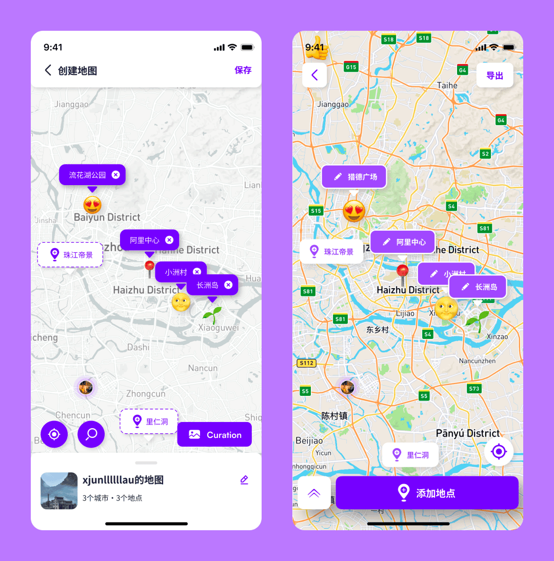
Map styles used in previous versions: Left: Light / Right: Streets
The Need for a Unique exping Map Style
As our user base grew, we started receiving more diverse feedback:
"The map style isn't unique enough, it's too similar to regular maps"
"I want to see clearer street information"
"The map is too busy, it affects the overall look"
"I'd like to make a hiking map that shows elevation"
"It looks like it's borrowed from another map"
"It lacks character"
This feedback made it clear that we needed to do more. Our users understand exping's potential better than we initially did.
They have deeper needs, requiring a map style that better aligns with their vision. We realized that one style isn't enough - we need to support multiple styles to meet these varied needs.
The comment about lacking character particularly struck a chord. We realized we had essentially been borrowing someone else's design rather than creating our own.
So, in addition to meeting the diverse needs of our users, we needed to create a set of "clothes" that truly reflects exping's soul and character. Our next steps were clear:
-
Meet the core needs of our explorers by providing access to more map styles
-
Design our own unique map style that fully embodies exping's brand identity as a "map tool"
-
Continue with exping's original mission of using maps as a carrier for user-generated content
Charting exping's Course in a World of Diverse Map Styles
Explorers constantly come up with new ideas, wanting to add pictures, ratings, travel methods, and more to their maps. As usage becomes more diverse, we need to consider how to effectively display all this user-added content on the map. We see ourselves as both a "tool" and a "canvas", hoping to shift the focus to the various places users want to visit or have visited.
Embodying exping's Unique Style
By defining ourselves as a canvas, we knew our unique style needed to be primarily supportive, complementing user-generated content. In exping light, we deliberately simplified the map itself. We even used a white base color, while still retaining essential information like road networks and public transport stops.
We downplayed certain details, opting for an overall flat design and using exping's signature purple tone. By subtly presenting the map's inherent information, we aimed to highlight user-added markers and routes. The large "blank" areas of the canvas invite users to freely express their creativity.


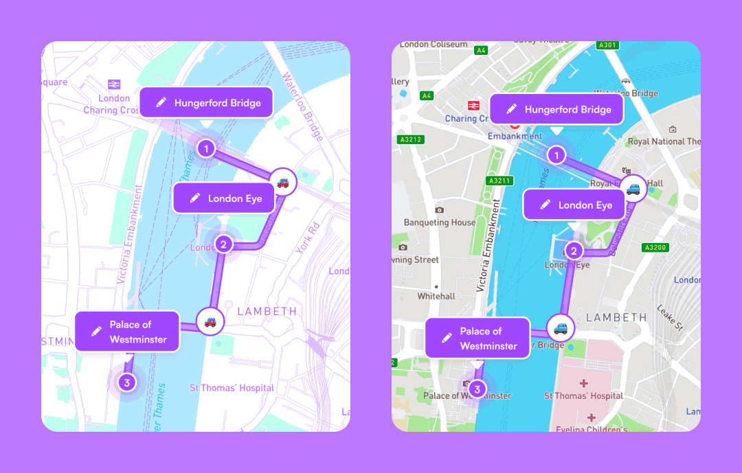
Comparison between exping light and conventional maps in practical use
Challenges in Creating exping's Unique Map Style
When we first applied the new style to the exping interface and saw how harmoniously it interacted with other elements, we knew it was time for user feedback.
This isn't exping's first attempt at visual innovation, and we know this version may not be perfect or satisfy everyone's needs. We're prepared to hear diverse opinions, and we welcome them - it's all part of the growth process.
Ultimately, the success of our map style will be determined by user response.
The Purpose and Concept Behind exping's Unique Map
The goal of exping light is straightforward: we've reduced the map's complex spatial information to create a harmonious backdrop for our explorers' creative content. By increasing the map's "blank" areas, we've enhanced its adaptability. We see ourselves as the "stage backdrop", allowing our users' "performances" to take center stage.
Over these months, we've seen the birth of many fascinating "themed maps", both for outdoor adventures and city exploration. These scenarios require different types of information to be presented on the map. With this update, we hope to see users flexibly applying our various map styles to create truly personalized maps:

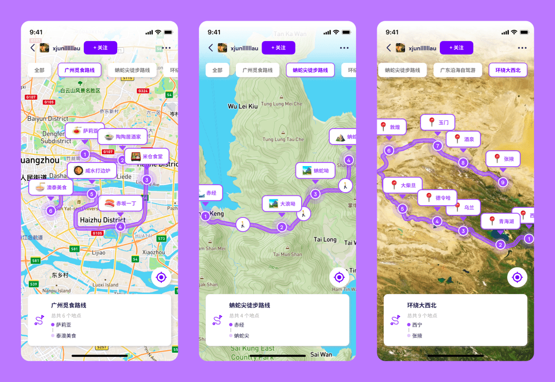
An example of the designer's own outdoor map creation
For mountain hiking, users can choose "outdoor" or "satellite" styles.
These styles include outdoor spatial information, showing elevation or real-scene imagery to enhance your markers.
For urban exploration and check-ins, "street" or "traffic" styles might be more appropriate.
These styles better represent the viewer's perspective, showing traffic conditions or nearby streets.
And many more possibilities...
Looking ahead, we aim to create map styles for even more scenarios, such as diving, cycling, historical exploration, and more, expanding the horizons of map creation.
We can't wait to see the increasingly personalized maps our explorers will create.
To cater to different creators' needs, our new version "v1.2.3" not only introduces exping's exclusive map style but also launches 7 additional map styles.
This update goes beyond diverse map styles - we're also rolling out advanced marking features.

Multiple map styles, adaptable to various map creation scenarios
🎨 Personalized maps: Choose from 9 map styles to match your preferences and scenarios
🛤 Route upgrade (Beta): Increased route limit to 7, with up to 30 locations per route (these limits are still being tested - we welcome your performance feedback)

Expanded map route limits
These features are part of the exp+ benefits designed for our early supporters who pre-paid for membership. If you're a pre-paid member, update to the latest version to get early access to these exciting new features.
Share